Heuristic Evaluation: Apple Control Center
Overview
Apple’s Control Center, introduced in IOS 7, provides a place for users to access the most commonly accessed settings such as brightness, volume, and wireless settings. It has gone through design iterations, with it most recently being redesigned to feature a card design. In this report, I will analyze the current state of Control Center and examine its user experience through heuristic evaluation.
Heuristic Evaluation
A Heuristic Evaluation is a way of evaluating an existing product against a set of tried and true principles or “rules of thumb” known as heuristics. Today, I’ll be using Jakob Nielsen’s list of Heuristics defined in his 1994 Paper “Enhancing the Explanatory Power of Usability Heuristics”. These heuristics have thus far stood the test of time despite vast technological advances, suggesting their ability to define the core of effective interaction design, independent of specific technologies. I will not cover all of the principles, just the ones that are most relevant and stood out to me during my analysis.
Visibility of System Status
“The design should always keep users informed about what is going on, through appropriate feedback within a reasonable amount of time.” (Nielsen, 2020)
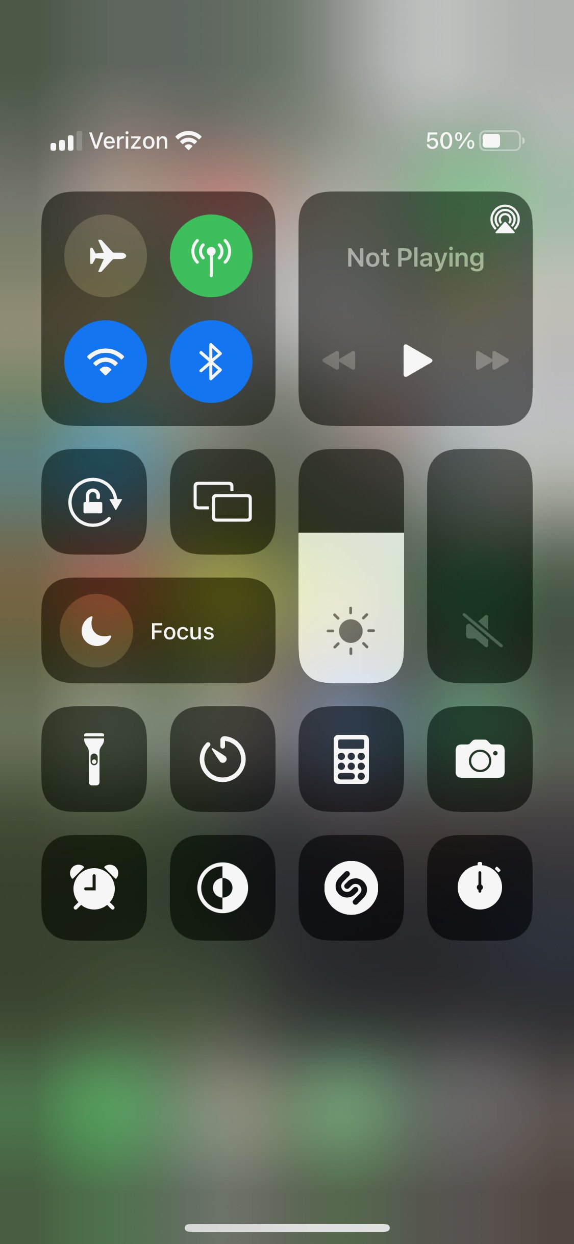

Control center’s main job is to make it clear and transparent to interface with and modify the system status, so the feature’s success lies directly within its ability to make the system status visible. Apple does a very effective job at clearly denoting the state of the different settings in Control Panel. There are two main ways that state differentiation is accomplished: modulating color or changing visible sliders. Settings that utilize color to denote change include the flashlight, wireless controls, dark mode, and rotation lock. Modulating color makes sense, as in a 2021 eye-tracking study on the effects of icon color and shape on search time and subjective user experience found that varied colors in icons led to decreased search time and better ease of use training (Liu et al, 2021). Settings that utilize visible slider changes are brightness and volume. Additionally, some settings pop up with additional information, such as dark mode which pops up with a message clarifying the exact implications of toggling it on and off. Vibration is also utilized to give the user feedback when a setting’s expanded view is triggered.
Match between system and the real world
“The design should speak the users' language. Use words, phrases, and concepts familiar to the user, rather than internal jargon. Follow real-world conventions, making information appear in a natural and logical order.” (Nielsen, 2020)

As one would expect from Apple, they use icons that users are very familiar with to conform to what users are used to to eliminate the system learning required. Icons are industry standard.
Consistency and standards
“Users should not have to wonder whether different words, situations, or actions mean the same thing. Follow platform and industry conventions.” (Nielsen, 2020)


On mobile devices, there is the convention of accessing additional interaction options by long pressing on an element. Apple utilizes this in a consistent way within Control Center. To access the expanded version of a setting, one simply needs to long press or press hard and use Apple's 3D touch. This interaction is consistent throughout, and brings up unique expanded options depending on which setting is being interacted with.
Flexibility and efficiency of use
“Shortcuts — hidden from novice users — may speed up the interaction for the expert user such that the design can cater to both inexperienced and experienced users. Allow users to tailor frequent actions.” (Nielsen, 2020)


At a macro level, providing a good shortcut to the most commonly adjusted settings is the central function of Control Center. Within Control Center, there are further shortcuts given to the user such as granting the user the ability to copy the last calculator result, access to specific camera modes, and the ability to enter an expanded wireless settings view that provides much of the functionality of the system settings app without having to navigate to a separate application.
Aesthetic and minimalist design
“Interfaces should not contain information which is irrelevant or rarely needed. Every extra unit of information in an interface competes with the relevant units of information and diminishes their relative visibility.” (Nielsen, 2020)

As is to be expected of Apple, Control Center is designed in a very minimalist manner, with text used only when strictly necessary. For example, the only control that is labeled is focus mode, as it is the only setting without an icon that would be instantly recognizable to a new IOS user. Other than that, it has clean, clear, and simple icons.
Conclusion
As Apple is a multi-billion dollar company, all of their systems are designed to be extremely user friendly. Consequently, it was difficult to identify any areas where I felt Control Center violated the heuristic principles. While I went in intending to find some areas to challenge Apple, it led me to really appreciate the hard work put into making their interface and UX design close to flawless (if flawless even exists in UX design, that is).
References
Liu, W., Cao, Y., & Proctor, R. W. (2021). How do app icon color and border shape influence visual search efficiency and user experience? evidence from an eye-tracking study. International Journal of Industrial Ergonomics, 84, 103160. https://doi.org/10.1016/j.ergon.2021.103160
Olsson, T., Lagerstam, E., Kärkkäinen, T., & Väänänen-Vainio-Mattila, K. (2011). Expected user experience of mobile augmented reality services: A user study in the context of shopping centres. Personal and Ubiquitous Computing, 17(2), 287–304. https://doi.org/10.1007/s00779-011-0494-x